In 2005, Executive Director/CEO, Abby Mosher founded Tomorrow’s Rainbow, a 2.5-acre farm in Coconut Creek to help South Florida kids and their families navigate through overwhelming loss, grief, and trauma. Today, the property hosts a series of peaceful healing gardens, memorial spaces, and tranquil settings for therapeutic play and recovery. Additionally, their program also includes counseling services with therapists and incorporates time with their barnyard staff – miniature horses, goats, standard horses, a donkey, and a pig – to help connect with kids on a deeper level. But, after 15 years of providing this important service, Abby found herself needing some help navigating the rebranding process.
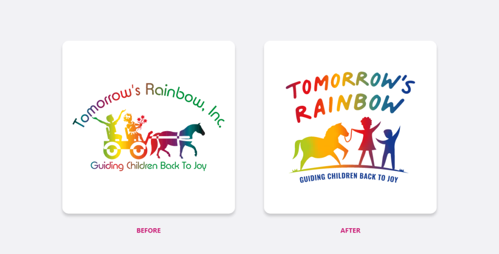
First, they had outgrown their original logo. Though they loved it deeply, they understood that it had become outdated both in style and function and didn’t reflect the diversity they needed it to. Next, the horse and cart didn’t accurately represent the experience or their unique “four-legged counselors.” Furthermore, the organization had grown so much over the years and become a real pillar of support in the community. They also knew they needed to bring their branded assets together overall in a cohesive way, and really step up the visuals to reflect the true high-quality services offered. Their organization relies heavily on various printed materials and there wasn’t a consistent theme throughout. It was time for professional help.
The group had attempted twice with different design agencies to improve the logo while still keeping it personal and true to themselves. They were left feeling “burned” and burned out each time. Having spent a bunch of money without anything to show for it, it must have been a bit overwhelming for Abby to try again. However, after we met with Abby and Patrice Blair, Vice-Chair of their Board of Directors, they saw something different in us. They agreed to give us a shot.
The unspoken messaging of the logo was always our top concern. As this was a very personal, emotionally invested cause for Abby, she and Patrice needed to feel certain that the final results would truly reflect the organization, a natural evolution, and the children and community they serve. The fact that they’d had a couple of less-than-stellar experiences already had helped identify some of the things they knew wouldn’t work. They were very clear about elements and seemingly tiny details that needed to be incorporated; things that were important in the equine community that ‘outsiders’ may not recognize. These details really meant a lot!
Throughout the logo redesign process, we studied each aspect in detail. From the positioning of the kids and the miniature horse to the sizes, shapes, and colors of each element, we considered the importance of each and every characteristic.
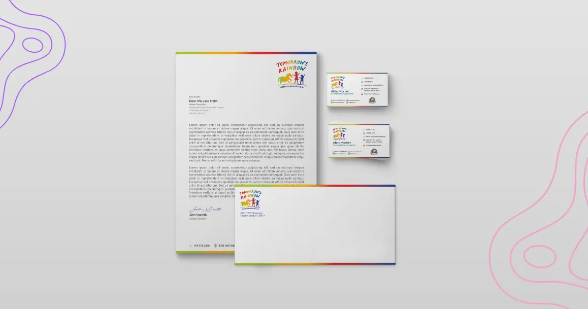
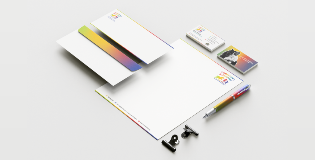
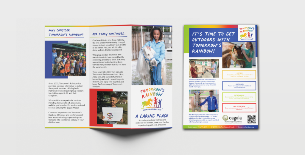
After we finalized the logo redesign process and we extended the branding style throughout the rest of the pieces, we saw something truly unique, bold, and beautiful emerging. As one could imagine, using a rainbow tastefully as a brand guideline could be a bit challenging. But by using the rainbow detail sparingly and with purpose, balancing it with plenty of white space, and employing select, individual pops of color, the end result of the whole package is stunning.
Colorful, bright, happy, and full of hope, Tomorrow’s Rainbow can utilize the assets we created in many different ways to truly connect with the community. We empowered their team to be self-sufficient by building most of the assets in Canva. This allows them the flexibility to create anything they need in-house using approved elements and colors.
Finally, they asked us to create a meaningful GIF of the logo. It turned out beautifully.
Throughout the logo redesign process, we studied each aspect in detail. From the positioning of the kids and the miniature horse to the sizes, shapes, and colors of each element, we considered the importance of each and every characteristic.
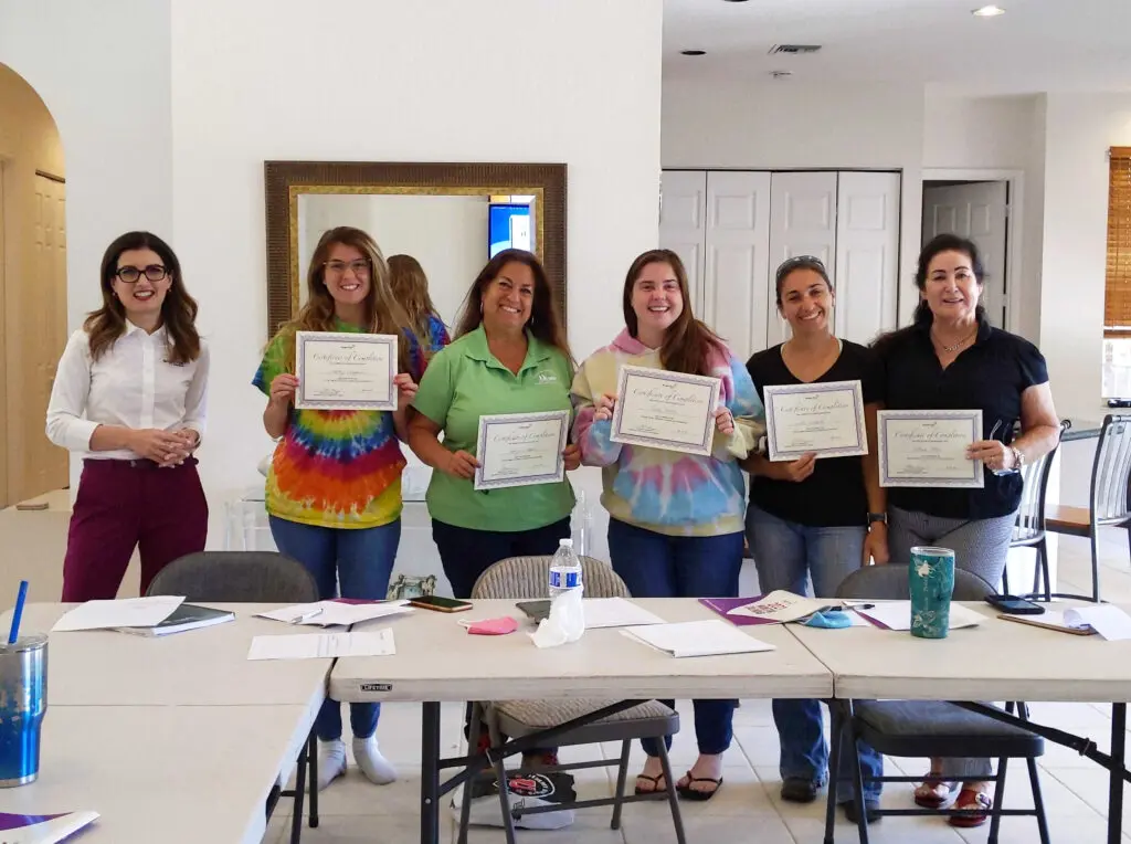
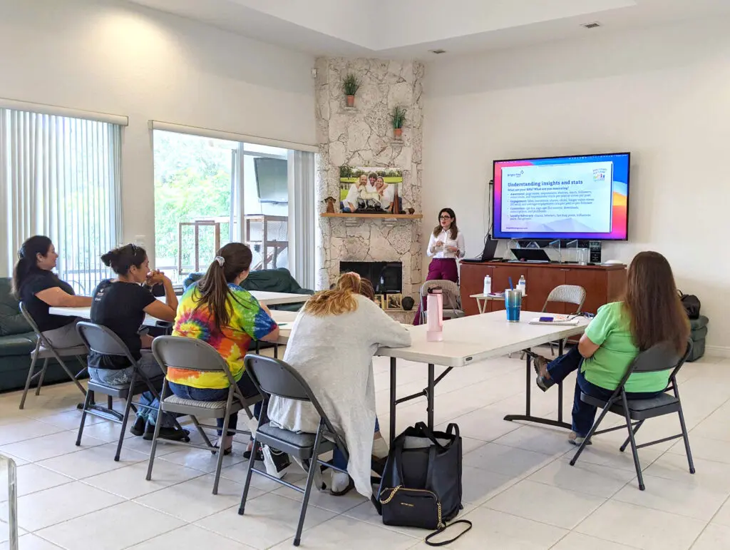
In addition to the rebranding process, our agreement included our social media training for nonprofits program. They received custom training modules we designed just for them and we gave the staff the tools to effectively use social media to improve reach and engagement with their followers. Over the course of the four-day workshop, we covered:
When a nonprofit organization is considering a logo redesign and ready to undergo the rebranding process, we understand that it’s critical – first and foremost – to listen to their wants and needs. Nonprofits are often a labor of love, borne out of a necessity and carried on by volunteers and donors who care deeply about the cause. We feel as though we were successful with this project because we truly listened to our clients. We care. They communicated and, as their marketing partner, we connected the dots they may not have even realized they were drawing for us. And the results speak for themselves.
Finally, the new logo and branding were unveiled at Tomorrow’s Rainbow’s 16th Anniversary Party and Open House, in October 2021. Everyone really loved the modern aesthetics and some even commented on the seamless evolution from the “old” graphics to the rich, beautiful new logo and style.
If you or someone you know needs a logo design for a nonprofit organization, please reach out to us. We have a soft spot for nonprofits and we’d love to talk about your mission and goals. After all, our purpose is to help you fulfill your purpose. It’s our way of trying to help make the world a brighter place.
Bright Pink Agency transformed the 4Ever Young Franchise website into a cohesive, modern platform using WordPress Multisite, scalable infrastructure, and SEO optimization. The redesign enhances user experience and supports franchise growth. Want to revamp your own franchise system’s website? Learn more about the Bright Pink Franchise Web design process today.
Stay Connected. Get actionable marketing insights delivered
straight to your inbox with our Marketing Highlighter.
Stay Connected. Get actionable marketing insights delivered straight to your inbox with our Marketing Highlighter.
© 2025 Bright Pink Agency. All Rights Reserved.