Have you ever had something really important to say, and you keep saying it, but it feels like no one is listening? But it’s really important, so you keep repeating it, not knowing what else to do. You reach out for help and someone says let’s try this a different way. Maybe this hasn’t happened to you. But it did happen to Water Smart Broward, a drowning prevention initiative operating under the Florida Department of Health, in Broward County. We were that someone.
It’s no secret that water is everywhere in Florida. The ocean, private and community pools, canals, rivers, springs, retention ponds, fountains… even Florida puddles can be pretty deep after a good summer rain. We have the country’s worst statistics when it comes to drownings. This task force is on a mission to spread the word about water safety, swim lessons, and ways to avoid becoming a statistic. And they have their work cut out for them.
Unfortunately, their message: “Drowning is Preventable” was getting a little bit lost in the layout and design of the website. The site was colorful and happy. Pictures of smiling children and parents greeted visitors. However, we realized that when it comes to water safety, happy, bright faces are just like swim floaties: they give users a false sense of security.
We needed to get the new message across to every single visitor that happened to glance at any page. Water safety is serious. It is somber. It is important. And as scary as it is, especially for parents, we needed to show everyone plainly: “Bad things happen when no one watches the water.”
In this new design, the first thing we suggested was to change the theme altogether. By selecting a new, darker color scheme throughout to contrast and complement their existing logo, along with a complementary pop of color, we really wanted the design to evolve into something more thoughtful and impactful. Visually striking graphics with lots of contrast between sections really make it pop.
We prioritized and reorganized the navigation overall to streamline it, keeping it modern and clean. Then we identified the critical elements and calls-to-action and placed them on the homepage with links to each subpage.
The Swim Coupon button stands out in the top navigation as this is arguably the most important call-to-action on the whole site. The hard-hitting Water Watcher Video was also placed at the top to make it easy to find and access, but it did not take up valuable real estate “above the fold.”
We placed the important statistics prominently, showcasing front and center what all of this is for. We highlighted their mission and vision clearly, as well as their impact on the community, to make it obvious to sponsors and donors what and who they are supporting by supporting this cause.
Next, we featured a separate section for Programs so families and community leaders could find and access them easily. A mention of the annual Symposium to highlight the event all year brings attention to the past success of previous events and also all attention to future opportunities for community speakers, sponsors, partners, and attendees.
The Get Involved section makes it easy for community volunteers and businesses to find ways they can help. Furthermore, featured sections for the logos of Partners – those working with Water Smart Broward to get the message out and develop programs, and Sponsors – those donating funds to make sure the organization can continue to do the work they’ve started.
The new eye-catching design, graphics, and pops of color throughout to guide users to the calls-to-action drastically changed the dynamic look of the site. We also improved functionality for the admin team by making it easier for them to add and update information in the back-end on their own. This promotes self-sufficiency, saving them both time and money. Maintaining lists of multiple swim lessons locations, managing the Swim Coupon registration data as it gets submitted, and updating CPR class information and Pool Safety Partners became much easier with the updated technology.
We love that we can continue to support the Water Smart Broward team as needed, long after the website launched. This includes performing basic maintenance, installing and upgrading the plugins that keep the site functioning correctly, as well as improving design elements. Additionally, we are always looking for ways to make the user experience smoother and the information in the back-end easier to use for the admins, through the use of improved widgets and new features. We are fully committed to helping Water Smart Broward fulfill their mission. And we look forward to working with them for years to come.
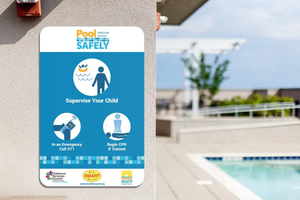
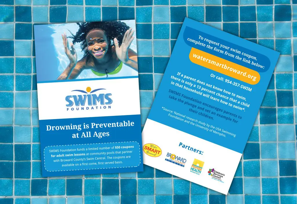
Having worked with Water Smart Broward since 2015, over the years, we have supported them with numerous marketing initiatives. Below are images of the artwork we designed for some of their campaigns.

Bright Pink Agency transformed the 4Ever Young Franchise website into a cohesive, modern platform using WordPress Multisite, scalable infrastructure, and SEO optimization. The redesign enhances user experience and supports franchise growth. Want to revamp your own franchise system’s website? Learn more about the Bright Pink Franchise Web design process today.
Stay Connected. Get actionable marketing insights delivered
straight to your inbox with our Marketing Highlighter.
Stay Connected. Get actionable marketing insights delivered straight to your inbox with our Marketing Highlighter.
© 2025 Bright Pink Agency. All Rights Reserved.